When we had our underlying idea secure and we had started the ball rolling with the first takes of the filming we decided to take the first photoshoot for our digi pack. This photo shoot in paticular being in the location of fields- as inspiration from our previous research from Ellie Goulding. In this section of the task we split our group up into two halves and two of us ( the photographer and the artist ) went to take the shoot whilst the others worked on editing the first part of the film.
BEST PHOTOS FROM OUR FIRST PHOTO SHOOT:
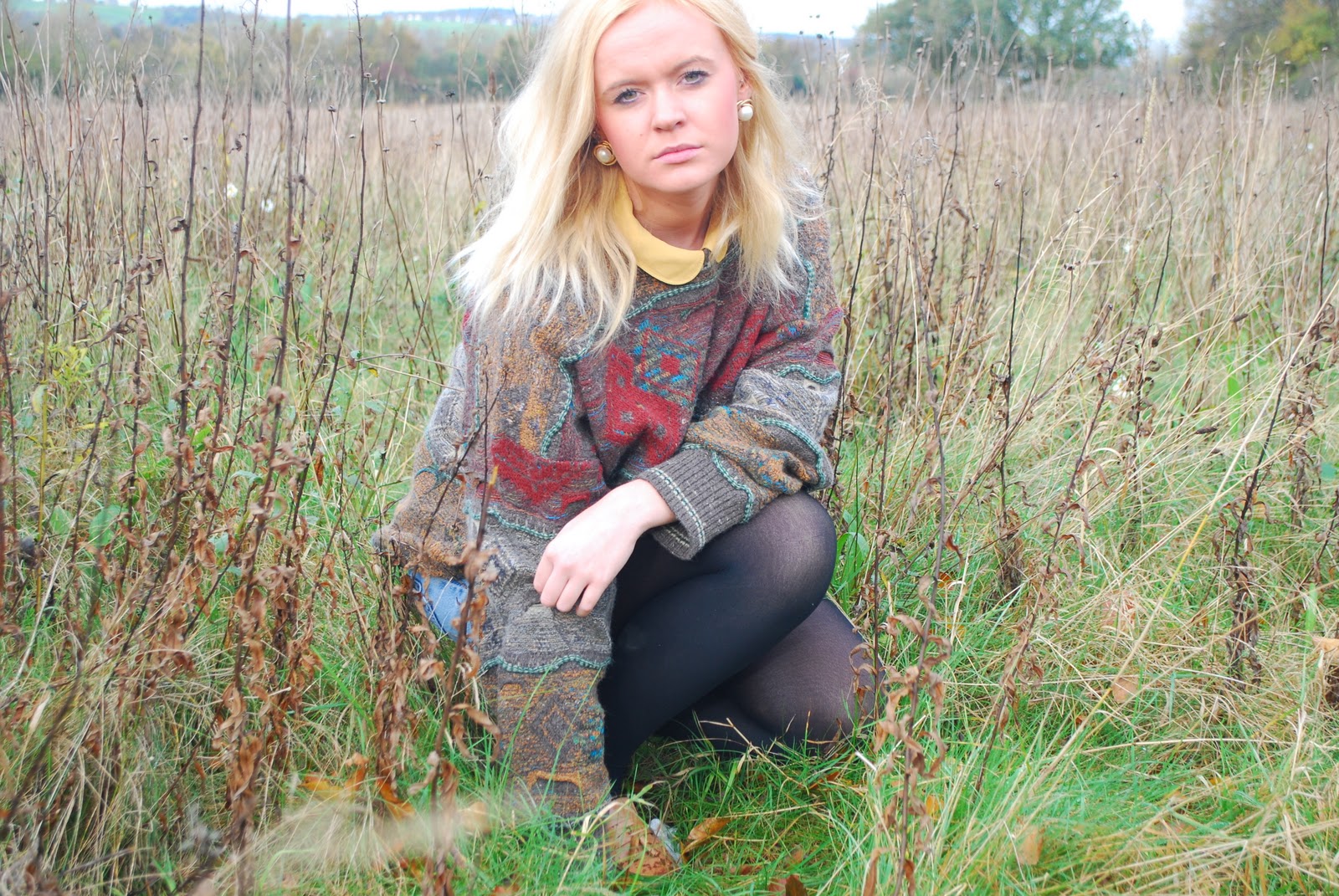
These images are a few of the best images that we took on the photoshoot. My task was to find an image that would work extremely well for the poster to promote the album of the new artist.
MY IMAGE
I liked this image because It stood out to me as an engaging photo of the artist with the eyes locked to the audience and the photo is of the whole top half of the artist- which in conclusion to my research I am aware that this is a key element to making a poster.
THE PROCESS
I used photoshop to create my poster.
STEP ONE:
I uploaded the image onto photoshop and I made the lighting brighter and more clear by using the brightness and contrast tool. Whilst doing this I was aware that the colours were extremely bright and didnt quite correspond with the reflection we wanted to create of our artist- mellow and indie music. Therefore I wanted to play around with black and white.
STEP TWO:
I used the black and white tool to create the effect and then I wanted to use some creative flare and I used the erase button to erase out the black and white from the background.
By doing this I was able to have the eye catching colourful countryside mixed with the black and white of our artist which sets the tone and theme of the album.
By creating the artist in the middle of the poster and creating the colour different from the background is key as it makes them the key figure which ultimately stands out.
I wanted to create a colour scheme that fits in with the background so I choose brown and white orginally as the colour scheme with the most important words in the biggest writing:
DARCY JONES (artists name)
Shelter (album name)
STEP THREE:
When looking at posters in NME magazines in class I realised it was important to put key information and formal writing in the poster aswell to adress the audience and promote the album more succesfully.
I stayed with the white and brown theme and created a transparent box on photoshop to make the white writing appear more and to stand out- as I realised this was key information that needed to be clear on the poster.
The writing is informative and reads:
the debut album released
2nd December 2011
Includes the single Skinny Love
I thought it was important to give information of a song that is on the album that will be popular to the audience as sometimes people know the name of a song they like but dont know the name of the artist- this will promote the album more and appeal to more people.
The writing underneath reads:
CD. LIMITED EDITION. 2CD LIMITED EDITION. GATEFOLD VINYL. DOWNLOAD
darcyofficial.co.uk
The intention for all this writing is to inform audiences of other means of getting access to the album too and to promoting the album and the artist even more.
STEP FOUR:
It is important to also promote the artists record company that they work with both for promotional and legal reasons. Therefore, I used the same logo we have used for the album cover and the digi pack and imported it into the poster.
STEP FIVE:
The end product:
Whilst on evaluation of the print screen before I loved the poster look however I found the writing underneath the transparent box quite light and hard to read and therefore I changed it to a darker box. Enabling the white writing to stand out more.
- I think the good points of the final poster is that it meets all the criterea that I found was important when researching in the initial stage:
-The artists face is the main element of the poster, creating an eye catching image and appealing to the audience.
-It has the main specific writing that is essential: the name of the artist, album title and release dates
-It includes promotional elements for the record company and the artist by including the company logo and the aritsts website.